
If the art is the meat, the layouts are the bones and sinew. It’s a fascinating part of design, undergirding text and imagery, propelled by colour, size, alignment and space both positive and negative. This requires serious consideration be made on every little element, and it’s a process I really enjoy! Sure, some layouts take a little to dial in, but once they’re there, it’s as satisfying as a finished piece of art.
When it clicks, it clicks!
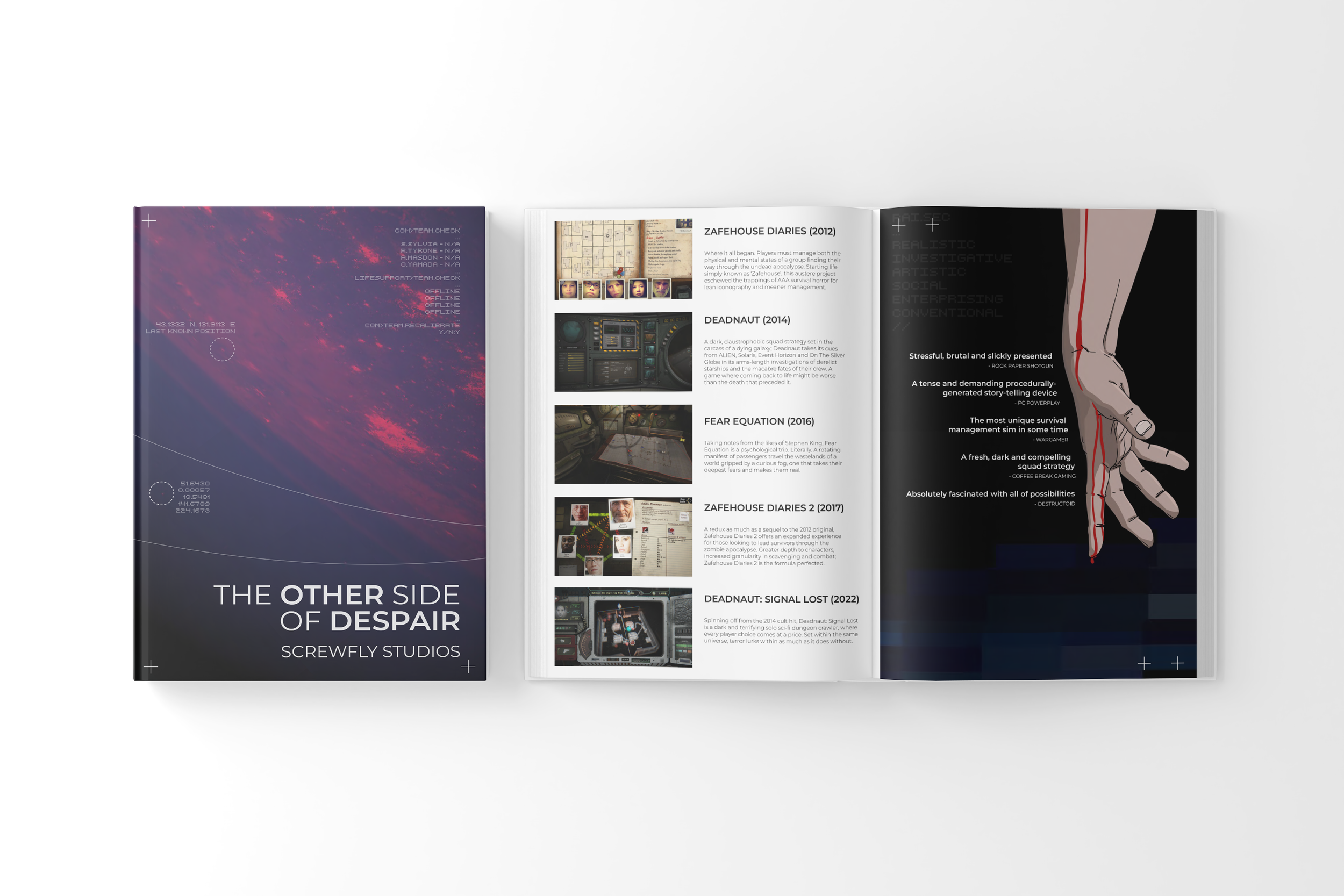
A short brochure project based on the works of Screwfly Studios, telling their history and game development history. The project asked for a wrap-around cover and some sort of hand-drawn element.

The Bank of Us Annual Report was one of my final graphic design diploma projects, which asked for all the skills gained hitherto. The project required the use of style guides, while allowing for unique takes on areas like graphs and charts.
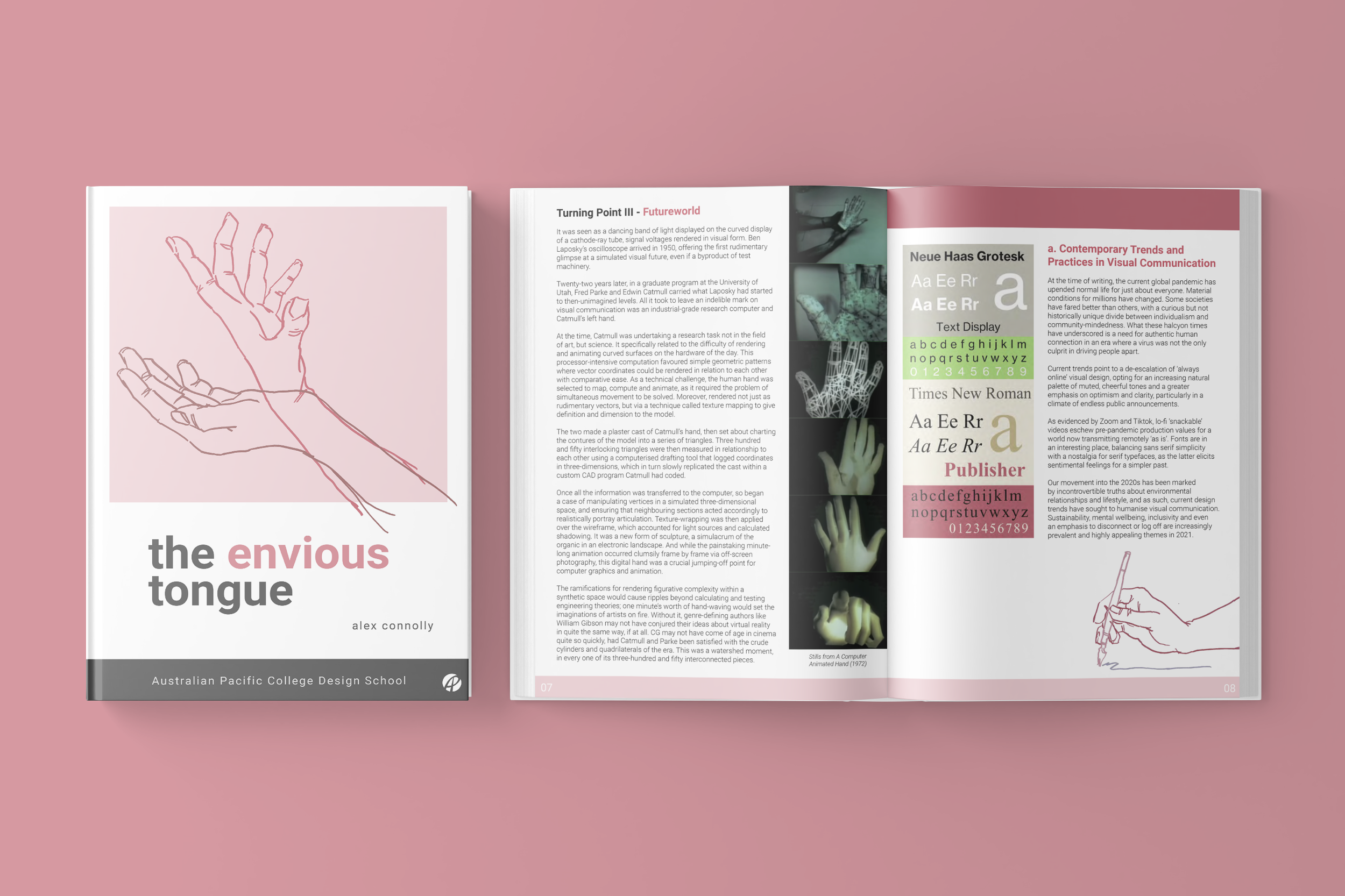
This was a small research project based around writing a treatise, then designing a book to present it within. The concept revolved around how the human hand and its neurological linkages and operation effect aesthetic.
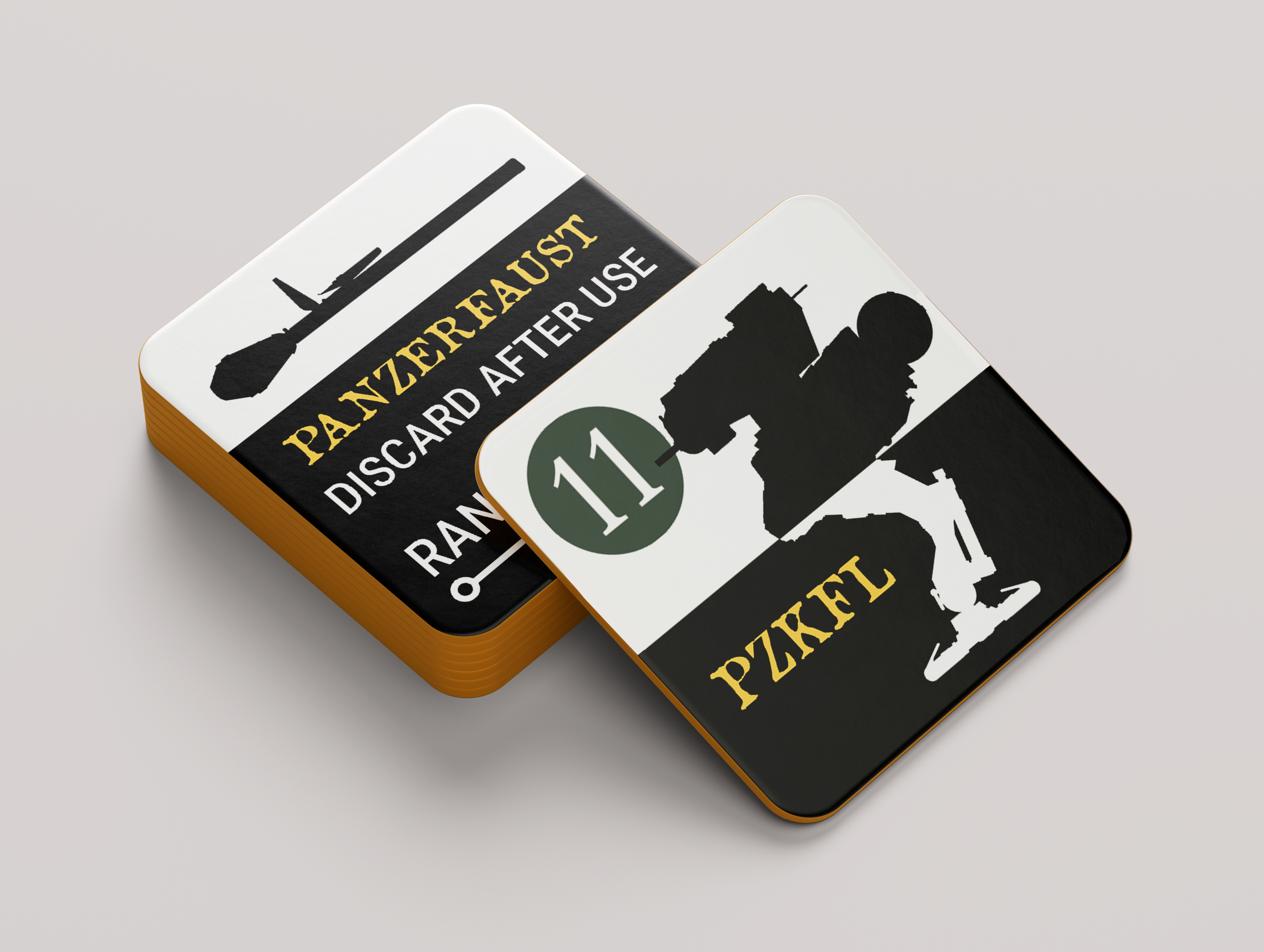
Some counter designs for an upcoming superscience/alternate history wargame for Compass Games. The design focus on components that small is one of legibility and differentiation at a glance.
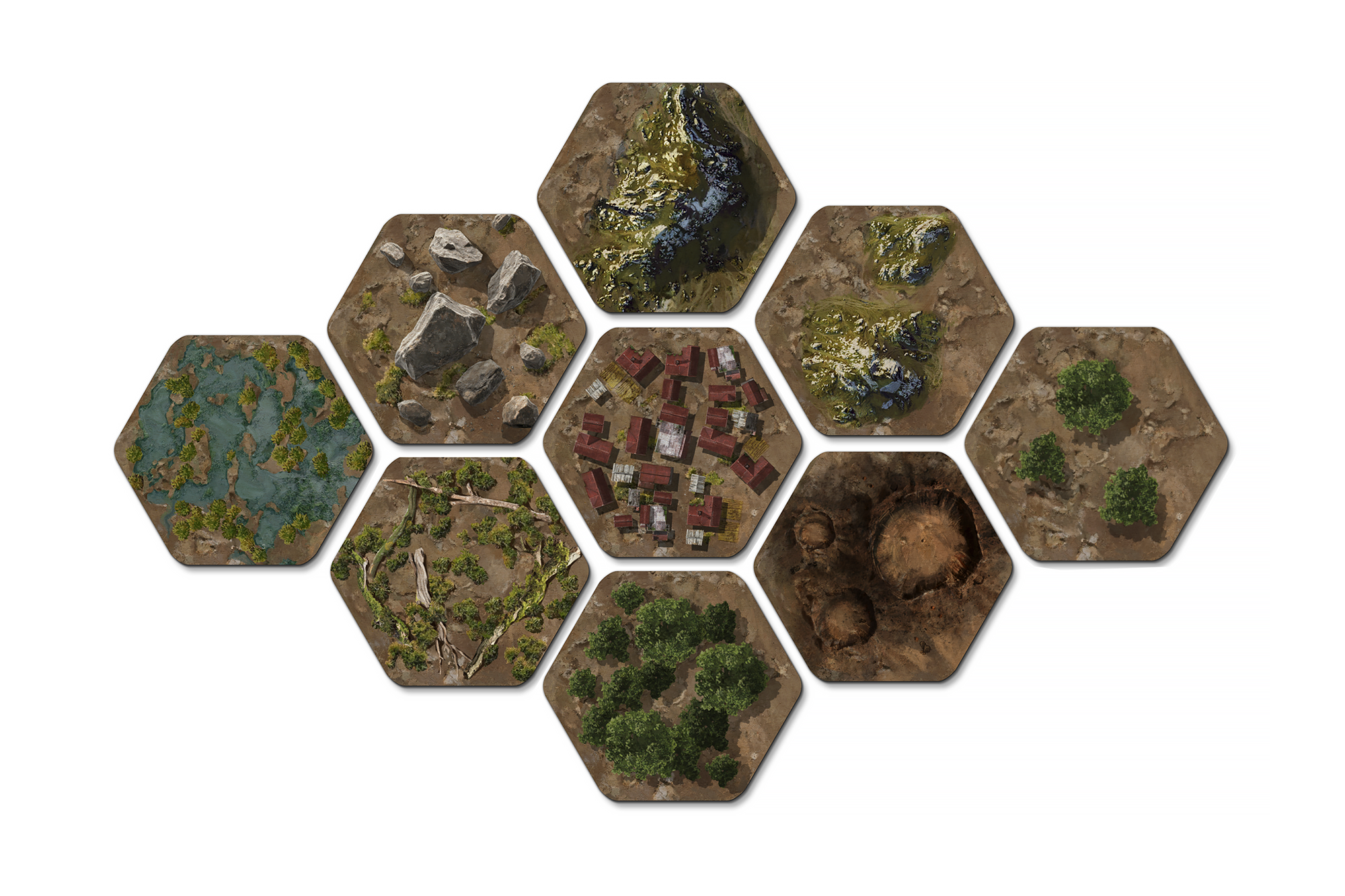
A group of painted terrain hexes for a wargame currently in production. The idea is for a rich, painterly and slightly impressionistic hex-map experience.
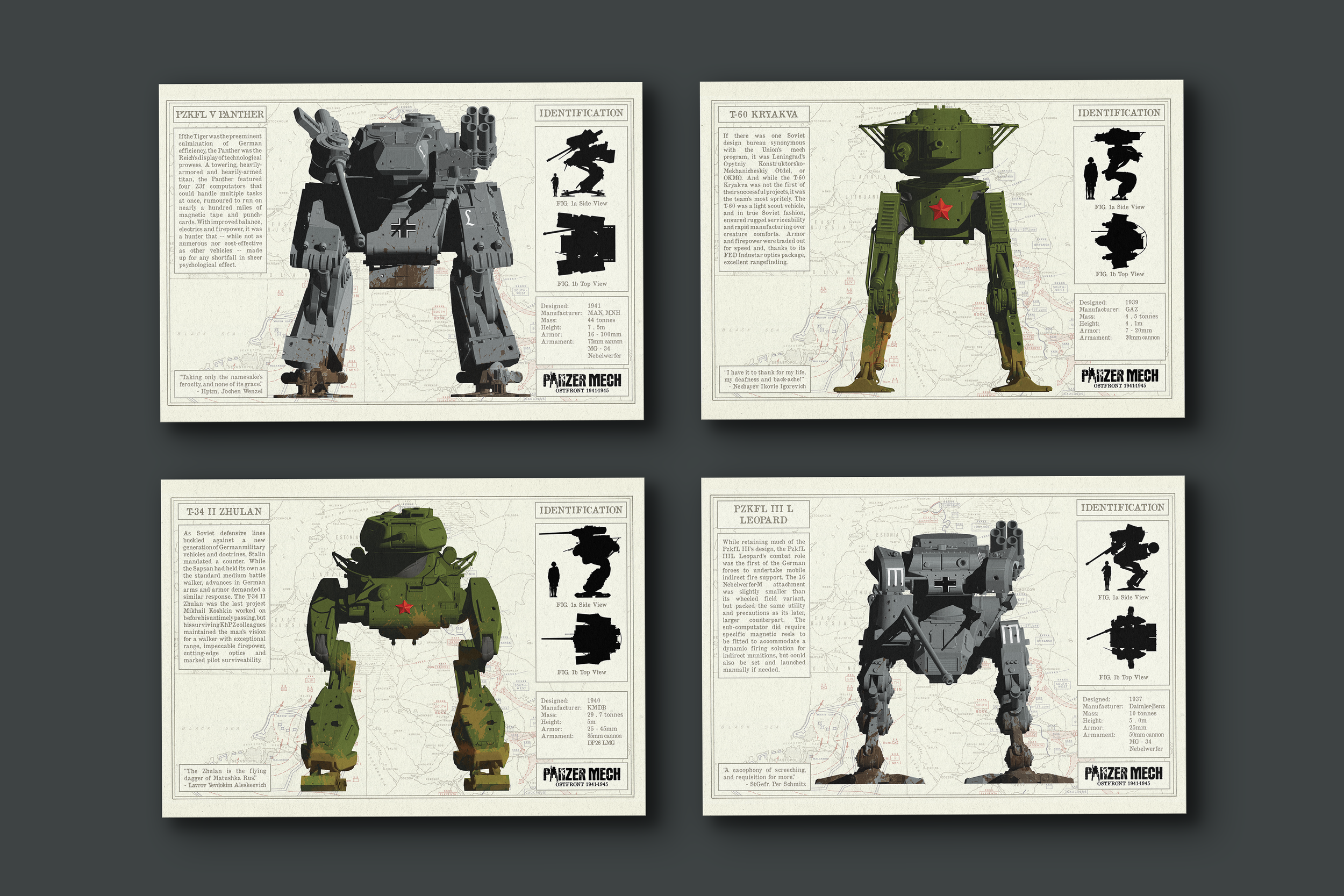
A selection of promo prints for an upcoming wargame. They feature painted units, identification and scale silhouettes, along with lore and statistics.